


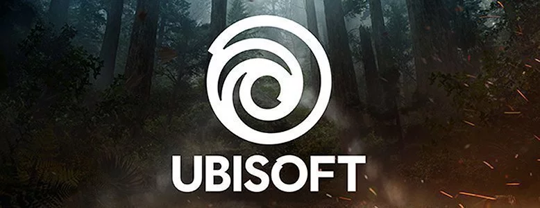
For the first time in 14 years, Ubisoft has changed its logo, opting for a swirl heavily influenced by flat design.
The new logo, which debuted on the UbiBlog, “marks a new era for Ubisoft,” the publisher proclaimed. “One with an increased focus on live and digital games as well as a player-centric approach to creating immersive worlds.”
“Today, we create worlds – worlds that live as video games, comics, movies, TV shows, books, and amusement park rides,” the post continued. “Our new logo is minimalist, modern and monochromatic. It’s a window into our worlds, giving a preview of what’s to come by highlighting the artistry that goes into creating them. The swirl and the letter O are both deliberately created to be reminiscent of hand-drawn shapes and represent our human qualities of enthusiasm, curiosity and the grain de folie that Ubisoft is known for.”

The opportunity also allowed Ubisoft to reflect on logos past. How ’bout that 80s logo, eh?
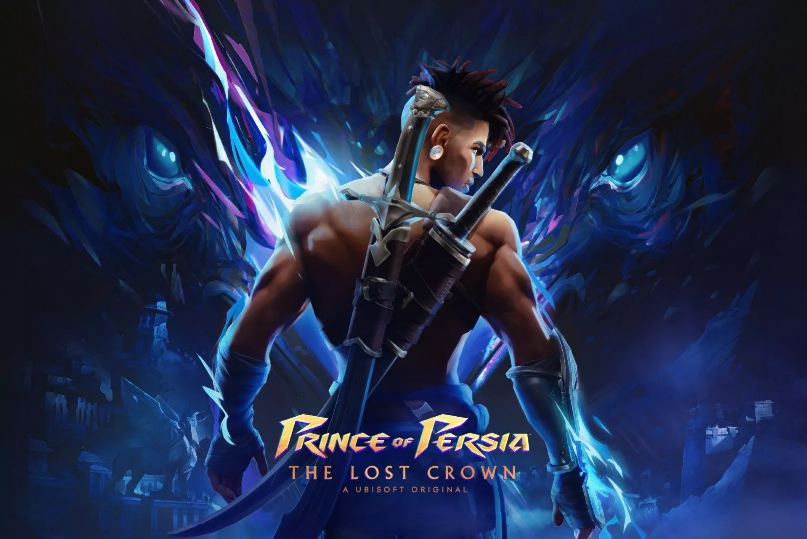
Ubisoft’s E3 2017 press conference takes place at 6.00am AEST on 13 June. It looks to detail the next titles in the the Assassin’s Creed, The Crew and Far Cry franchises alongside the rumoured Mario + Rabbid Kingdoms Battle being developed for Nintendo Switch.
This article may contain affiliate links, meaning we could earn a small commission if you click-through and make a purchase. Stevivor is an independent outlet and our journalism is in no way influenced by any advertiser or commercial initiative.